Styles in MS Word
If you don’t already use Styles in Microsoft Word, I highly recommend it! Despite what the term suggests, the benefits of using Styles go far beyond just aesthetics. Using Styles allows you to easily see an overview of the organization of a text that you’re writing, which can help you to work out structure and flow.
The following is a brief introduction to the way that I use MS Word Styles when I’m writing a manuscript. Of course, there are a lot of additional (and alternative) ways to use Styles, but here is somewhere to start if you’re new to this.
The basic principle
Imagine that you want to write a text in Times New Roman (TNR) font, with 3 levels of headings: 1) main section headings in bold Arial font, 2) subsection headings in bold TNR font, and 3) sub-sub-headings in TNR italic font.
You have two options: You can manually (in the HOME tab) change the font to TNR, start typing, and then anytime you type a heading, you highlight that text and change the font and/or bold/italics. This is the most obvious and common way to do this.
ALTERNATIVELY, you can use Styles to “tell” Word what you want your normal text, main headings, subsections headings, and sub-sub-headings to look like. Then, you “tell” Word which text is just normal text, and which is each kind of heading, and it assigns the aesthetic properties that you’ve selected.
The Advantages
By using Styles (rather than direct manual formatting), you gain 2 major advantages:
If you, later, decide that you want to change the aesthetic properties of your paper - let’s say that actually you want main section headings to be Arial bold and italics, and bright red! - you don’t have to go through and change each section heading. You can simply update the Headings style, and all text that has been assigned to that style will be changed.
MS Word will recognize which text is actually your headings, subheadings, and sub-sub-headings, etc. This will allow Word to easily construct a table of contents, and also show you the headings structure in the sidebar as you work - allowing you to always see an overview of the text that you’re writing.
How it works
The following instructions and screenshots are from MS Word for Mac v16.12 - so you’re might look a bit different, but the basic principles should be the same…
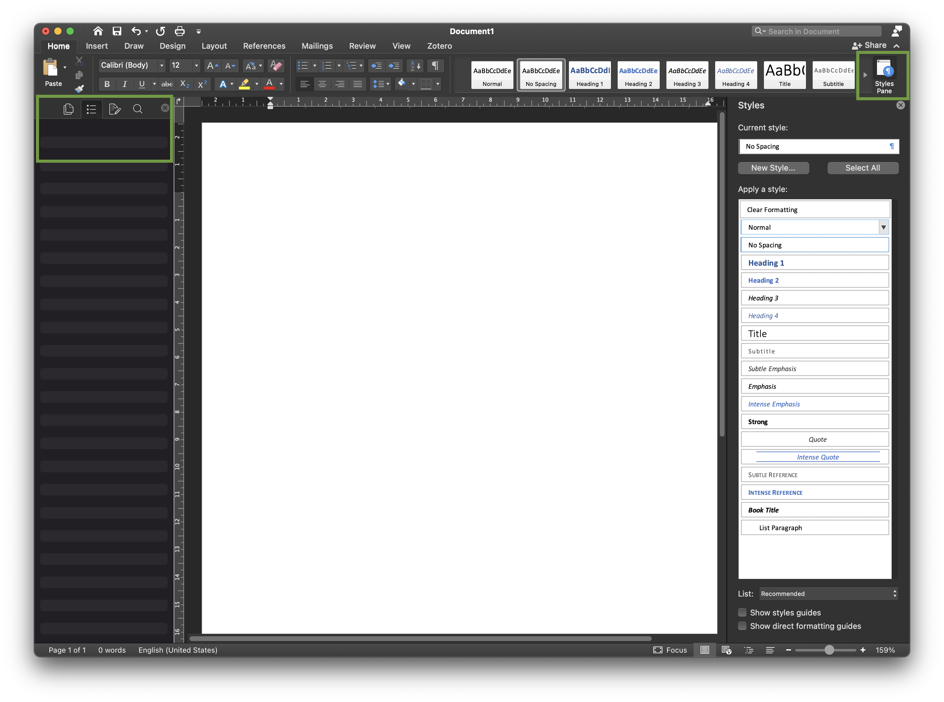
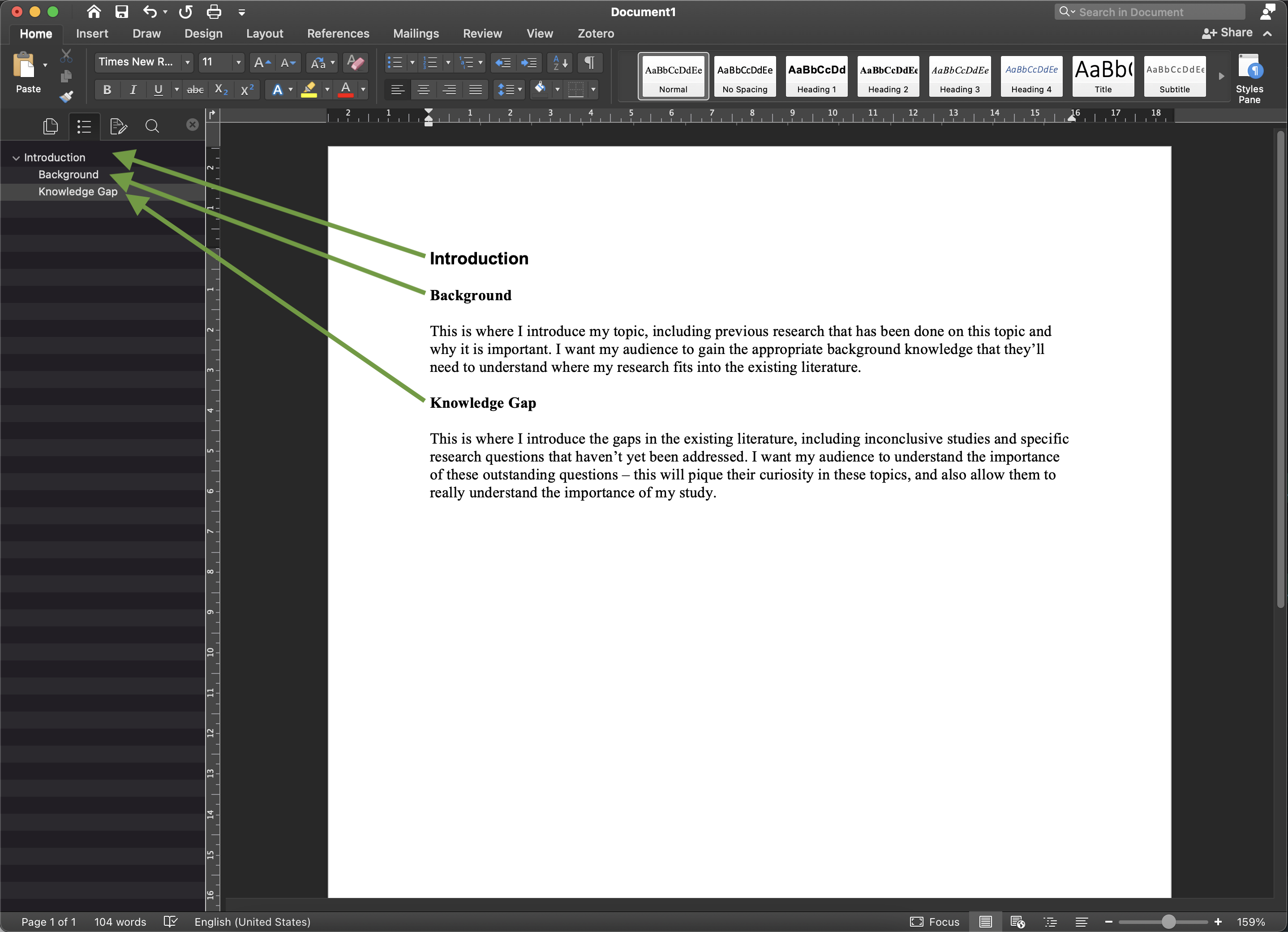
- Open a blank MS Word document, and go to View > Sidebar > Navigation. In the HOME tab, click on the button that says Styles Pane.You should see something that looks like this, with a blank sidebar down the left side, and the Styles Pane on the left…
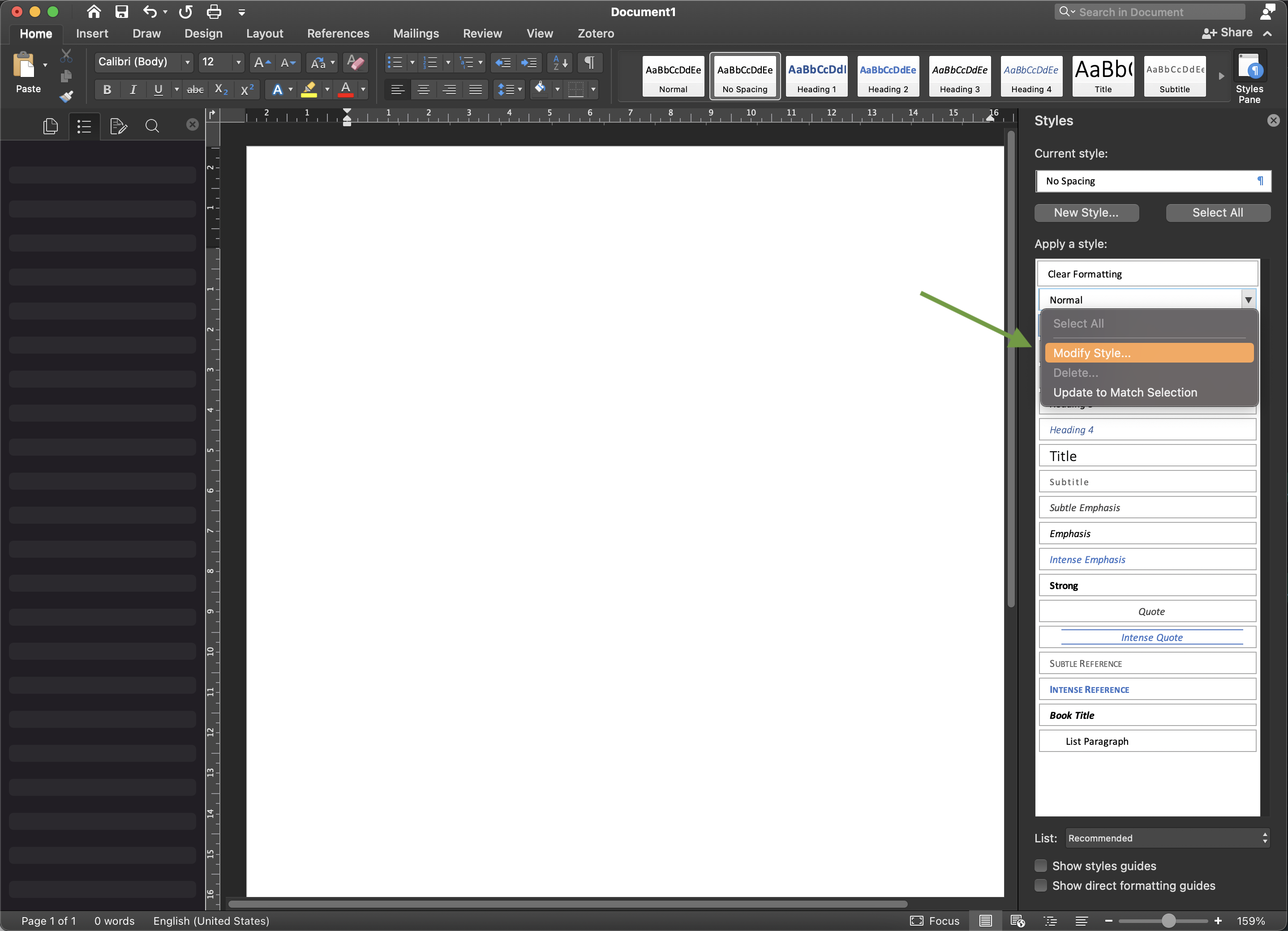
- Hover your cursor over the button that says Normal until you see the down arrow on the right. Click on that, and then on “Modify Style”.
- In the window that pops up, choose the font formatting to be what you want for the default, main text, of your writing. In this case, I’ve changed it to TNR, size 11. Click “OK”.

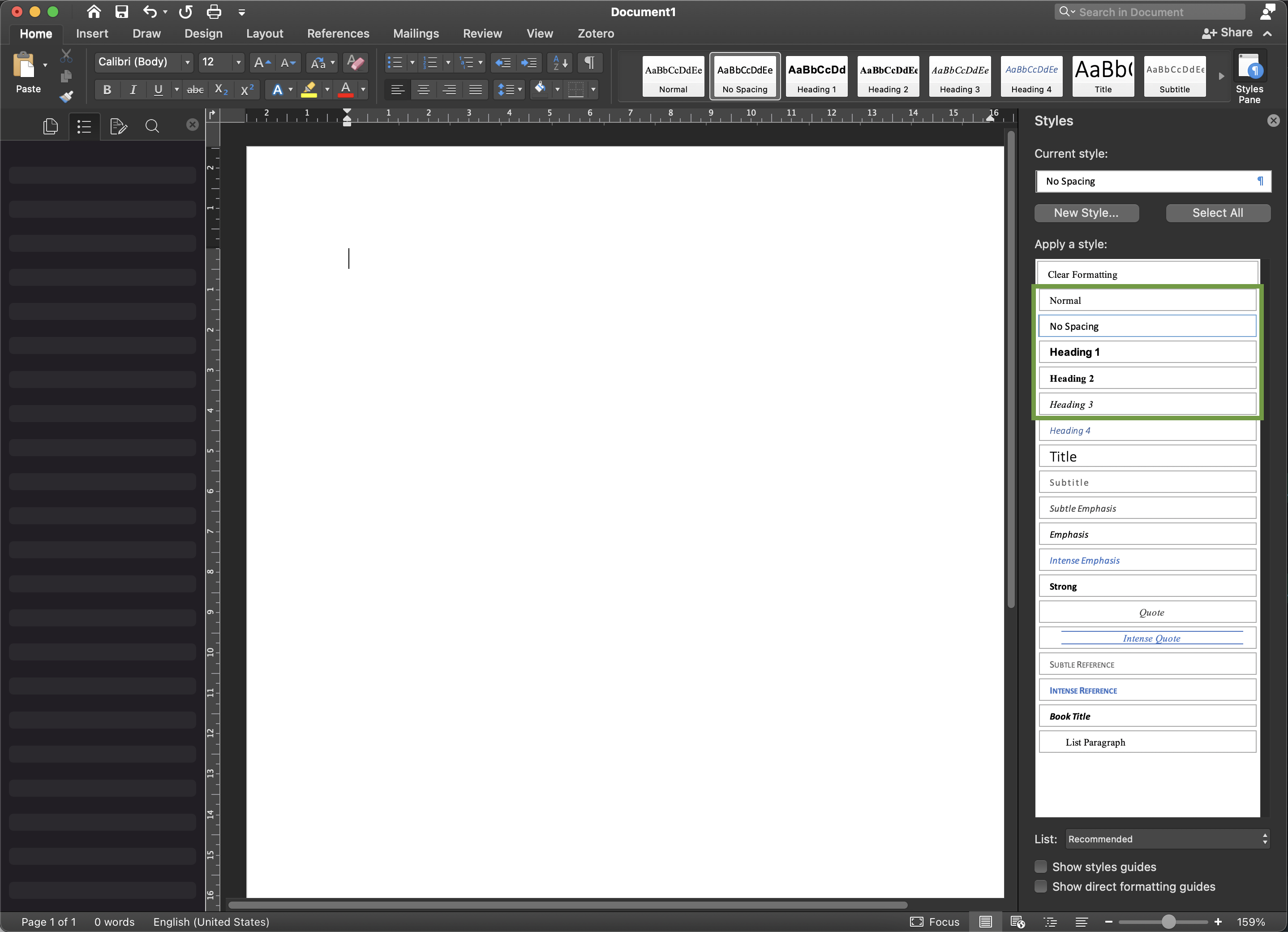
- Now, repeat steps 3 and 4 for each Heading 1, Heading 2, and Heading 3 - changing each style to be what you want (in this case, I am making them all size 11 & black, and then Arial bold, TNR bold, and TNR italics respectively.) Note how the look of the different styles changes in the Styles Pane and also in the buttons across the top HOME tab ribbon.
- You can now close the Styles Pane and begin typing. Type some titles and some text. Highlight text that you want to be each type of style, and then click the appropriate button in the HOME tab ribbon…
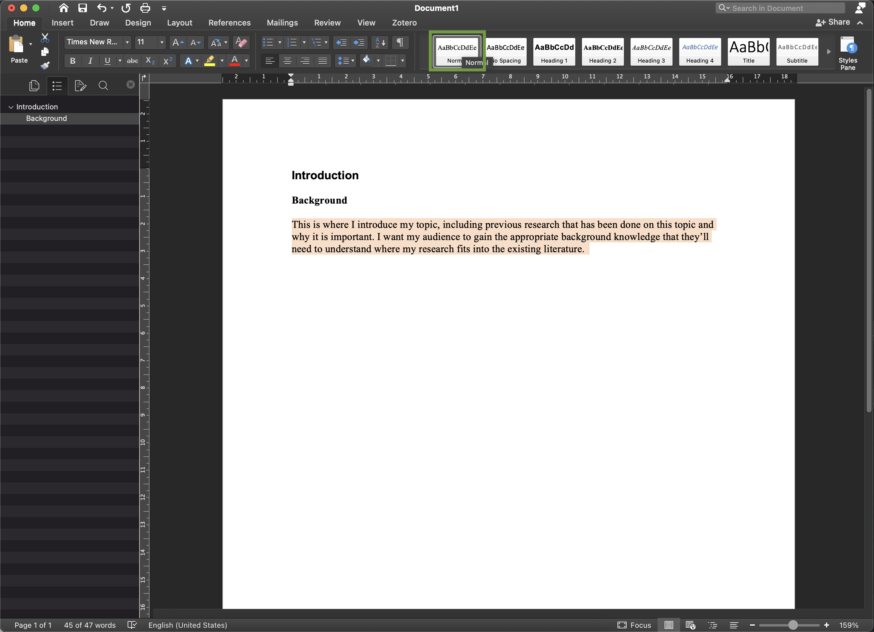
Notice how, as you highlight text and assign it a heading style, it will appear in the Navigation Bar on the left side of the screen. Subheadings will be indented under their over-headings. This is a really excellent way for you, your co-authors, and your proof-readers/reviewers to see the full overview of your MS.
- If you decide later that you want to change the aesthetics of a style - let’s say that you want the subheadings (Heading 2) to be red, you can reopen the Styles Pane, and modify Heading 2 to be red. When you click “OK”, you’ll see that all text which had been assigned to the style Heading 2 has been updated to be red.
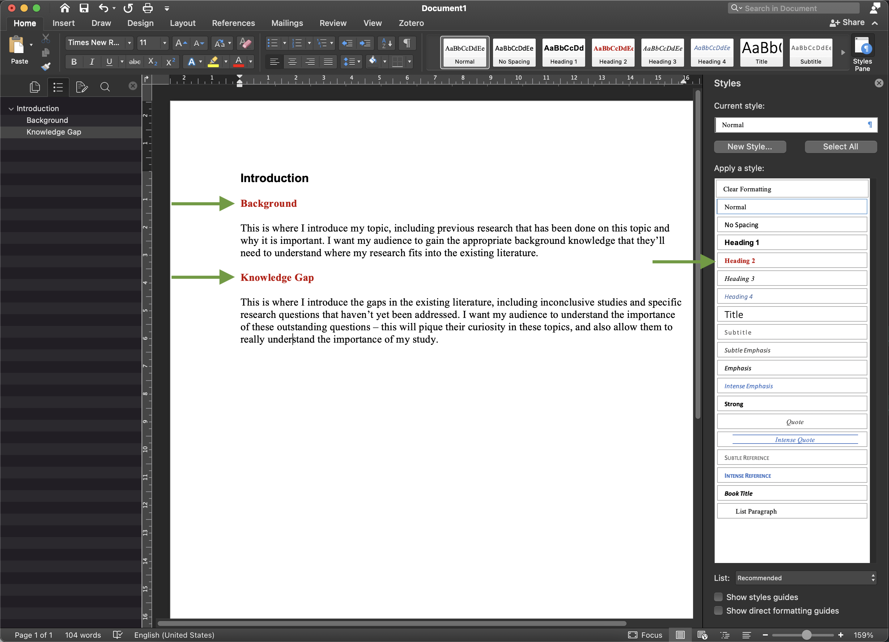
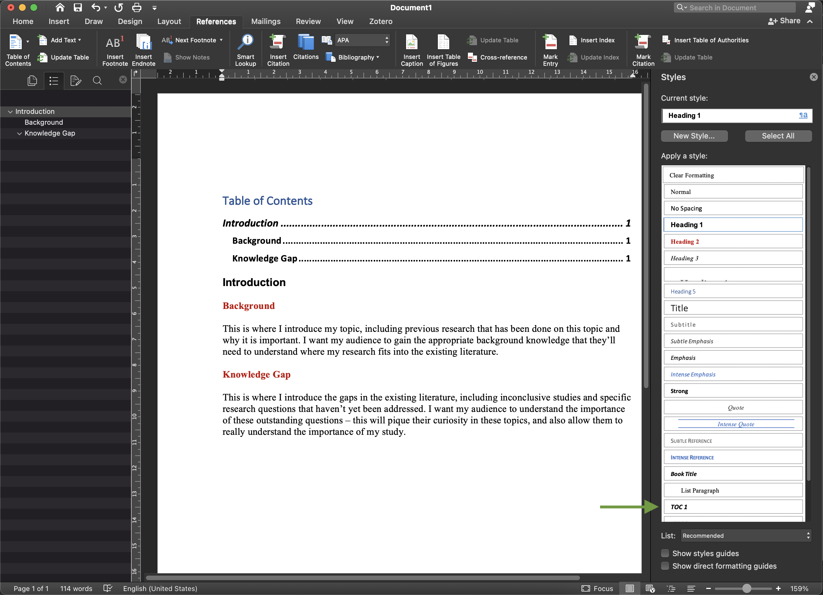
You can already see in this example that I have used superfluous subheadings - of course, for most journal article manuscripts, you wouldn’t include subheadings for “Background” and “Knowledge Gap”. However, I highly recommend doing this in early drafts. I will often even use a 4th level of subheadings (i.e., Heading 4 style) to give a little title to each paragraph. This makes it really easy to see the overall structure of the paper and to see if/where information might be missing, or superfluous and unnecessary. I especially find this useful in the Methods and Results sections, where I like to include sub(subsub)headings that allow me to see very clearly if each result has a corresponding data collection and/or statistic test method section, and vice versa.
Some basic alternatives
Of course, you can always start to assign styles to a document that you’ve already started, or finished, writing. You can simply set the aesthetics of the styles that you want, and then go through your text and highlight the different components and click on the style buttons in the HOME tab ribbon.
Another way of setting style aesthetics is to:
In the document itself, change the aesthetics of a piece of text using the regular font formatting tools (in the HOME tab ribbon, or under Format > Font…). You have likely already been doing this as you typed your text.
Open the Styles Pane.
Highlight the text that already has the aesthetic properties that you want, but that you want to assign to a specific style.
In the Styles Pane, find the name of the specific style that you want the highlighted text to be (in the case of the below example, I want Heading 4 to be size 10, TNR, light grey, italics), hover your cursor over the name, and then click on the down arrow on the right side. Select “Update to Match Selection”.
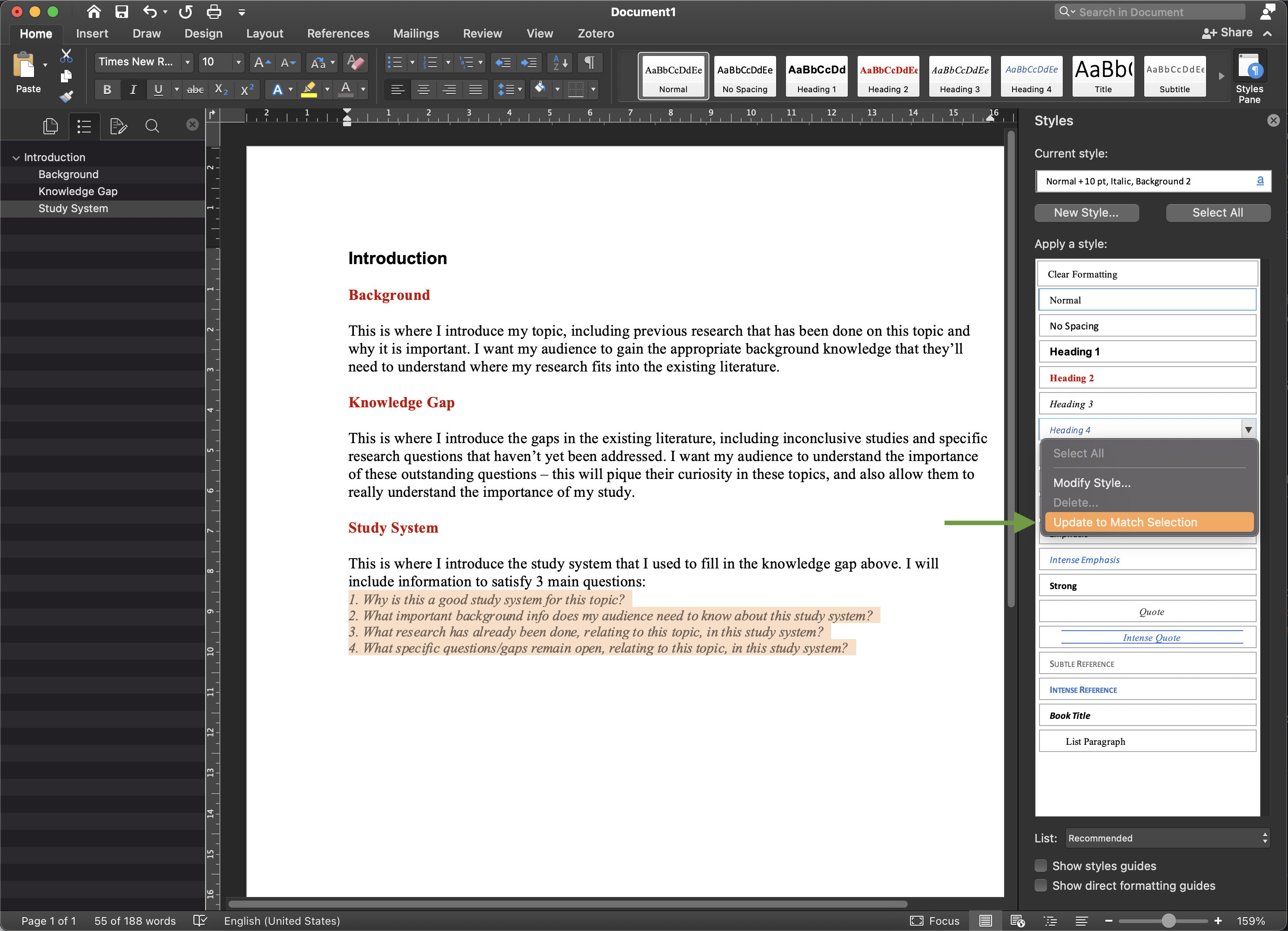
Now, that formatting has been applied to the Headings 4 style. Also, if any other text in the document has already been classified as Headings 4, it will be changed to these new aesthetics. (Note, however, that other text which has that similar formatting, but has not yet been designated as Headings 4 style, will need to be explicitly manually designated, it will not happen automatically.)
Adding a TOC
While I generally use Styles for the sake of easy mass-aesthetic changes and the usefulness of the Navigation sidebar, you may find that you occasionally want to make a table of contents (TOC).
To do this, first put your cursor where you want your table of contents to be (usually the beginning of your document). Then click on the REFERENCES tab and choose Table of Contents from the ribbon, and pick a format from the drop-down menu.
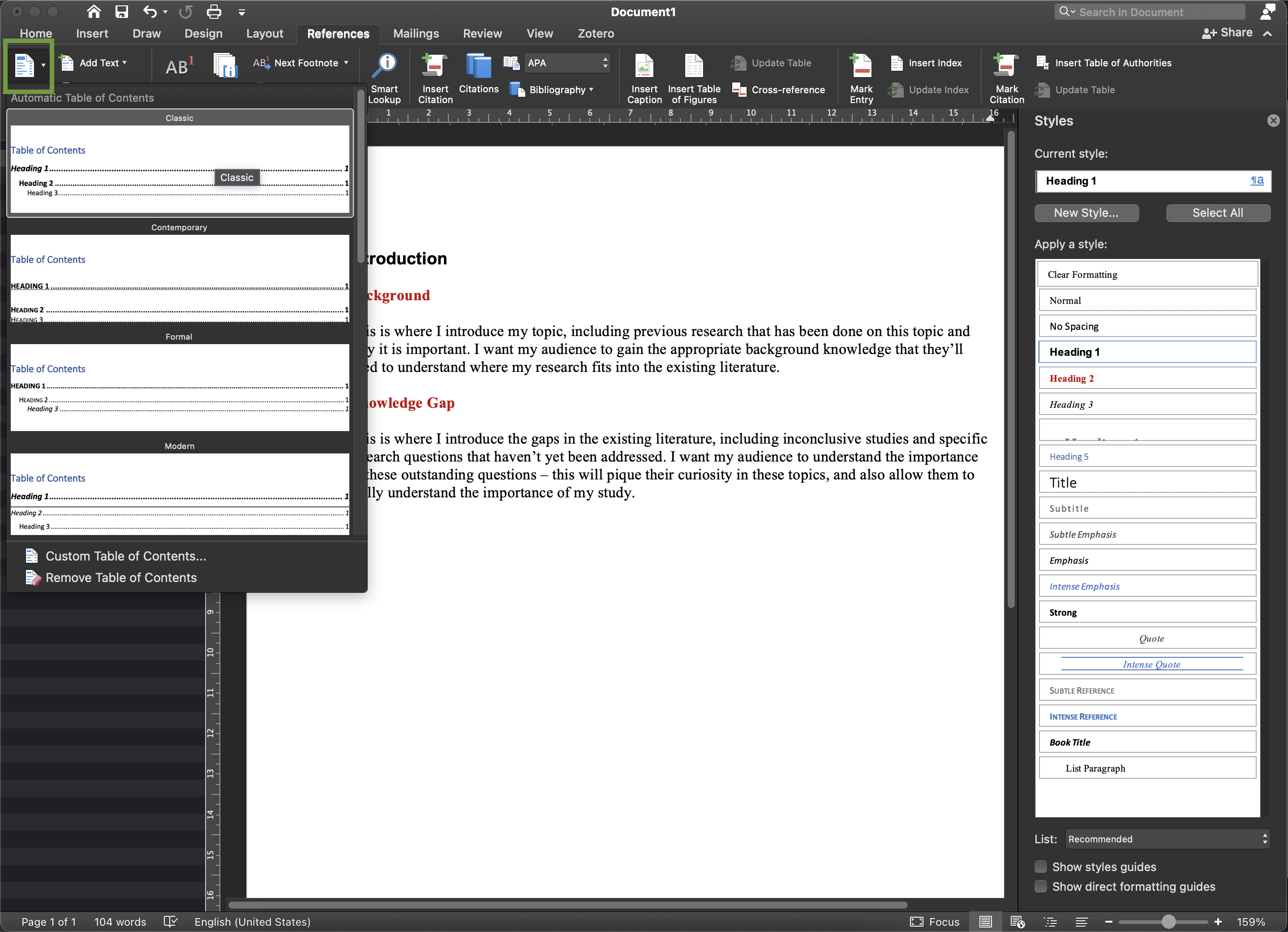
Note that, in a cruel twist of fate, table of contents entries have their OWN styles (separate from Headings styles), so the aesthetics that you’ve applied to your heading styles won’t transfer over into the TOC, only the content of those styles (i.e. the text). Super annoying.
If you want to change the aesthetics of your table of contents, reopen the Styles Pane in your document, and - now that you’ve added a table of contents - you will see new styles called TOC 1, TOC 2, etc. You can update/modify these styles to match your Heading styles (or not, whatever you want!).
Beware
There are 2 ways in which using styles can mess you up:
First, when you modify the aesthetics of a style, all text that has been assigned to that style will be updated to the new aesthetics. If you have manually (without using styles, just using font formatting tools directly) changed some text’s aesthetics in your document to be different than its assigned style’s aesthetics, it will now get updated to match the new (and other!) modified aesthetics of that style.
For example, let’s say that your Normal (i.e. default) aesthetics is TNR size 12. Your reference list is assigned to the Normal style but you have gone ahead and highlighted that section and changed the font size 10. Later, you decide that you want the Normal text to actually be a sans serif font, so you update the Normal style to be Arial (still size 12). Now, ALL text that has been assigned to the Normal style, will be updated! INCLUDING your reference list, which will change from TNR size 10, to Arial size 12 (i.e. you will lose the manual formatting that you did to reduce the size).
The way around this is to generally always avoid doing any manual formatting. If you want to change the aesthetics of any text, such as the reference list, or maybe text in a table or in a figure caption, MAKE A NEW “New Style” FOR THAT TYPE OF TEXT. There is a button near the top of the Styles Pane where you can select “New Style…” and give it a name and aesthetic properties. Make a References style, and a table text style, and a figure caption style, rather than just directly formatting the font for these different types of text.
Second, it is important to note that styles do not just include font aesthetics, but also other stylistic aspects. The one that often trips me up is paragraph formatting - here, the line spacing and indentation properties of text get encoded in the style. This is helpful if you want to, for example, have a special style for your reference list that includes the unique indentation properties of reference lists (usually, the first line of each ‘paragraph’ is flush with the left margin, while subsequent lines are indented… basically the opposite of regular paragraph indentation patterns). But it also means that you can fall into the above (first) trap with respect to paragraph formatting, not just font formatting. So if you manually set your text to be at 1.5 spacing, but then you update your Normal style to, say, a different font size (but the style’s line spacing is still set to the original 1.0), everything will switch back to 1.0 spacing.
The way to avoid these issues are, therefore, to be mindful of the paragraph formatting associated with each style, as well as the font formatting.